PCIS GOLD Branding Guidelines
Logo and Icon Usage
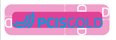
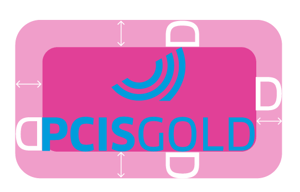
The icon (shown below) must be presented with the “PCIS GOLD” wordmark. The horizontal lockup is the main logo and is recommended for most applications. The stacked logo is reserved for cases where the horizontal format does not fit or perform well in the available space. The icon by itself should be used only when brand familiarity is already established with viewers.


Logo Spacing
Maintain clear space around the logo and icon. Avoid crowding so the mark stays clean and easy to recognize, as shown below..

Background Colors
Use white, PCIS Blue, or PCIS Grey as the preferred background colors for the logo. If the logo must sit on a photo, pattern, or another color you can’t adjust, make sure there’s enough contrast for the logo to stay clear and readable. The examples below demonstrate correct background usage.


Our Colors
Use our primary colors across all branding and design. Additional colors may be used alongside the primary palette, but they should be kept to a minimum.

Our Fonts
Roboto Black
Roboto Slab Light
Lorem ipsum dolor sit amet, consectetuer adipiscing elit, sed
diam nonummy nibh euismod tincidunt ut laoreet dolore
magna aliquam erat volutpat. Ut wisi enim ad minim veniam,
quis nostrud exerci tation ullamcorper suscipit lobortis nisl ut
aliquip ex ea commodo consequat. Duis autem vel eum iriure
dolor in hendrerit in vulputate.
Roboto Slab Bold
Roboto Light
Lorem ipsum dolor sit amet, consectetuer adipiscing elit, sed
diam nonummy nibh euismod tincidunt ut laoreet dolore magna
aliquam erat volutpat. Ut wisi enim ad minim veniam, quis
nostrud exerci tation ullamcorper suscipit lobortis nisl ut aliquip
ex ea commodo consequat. Duis autem vel eum iriure dolor in
hendrerit in vulputate velit esse molestie consequat, vel illum
dolore eu feugiat nulla facilisis at vero eros et.